B100.hr — a premium website for vending services, padel courts and office supply
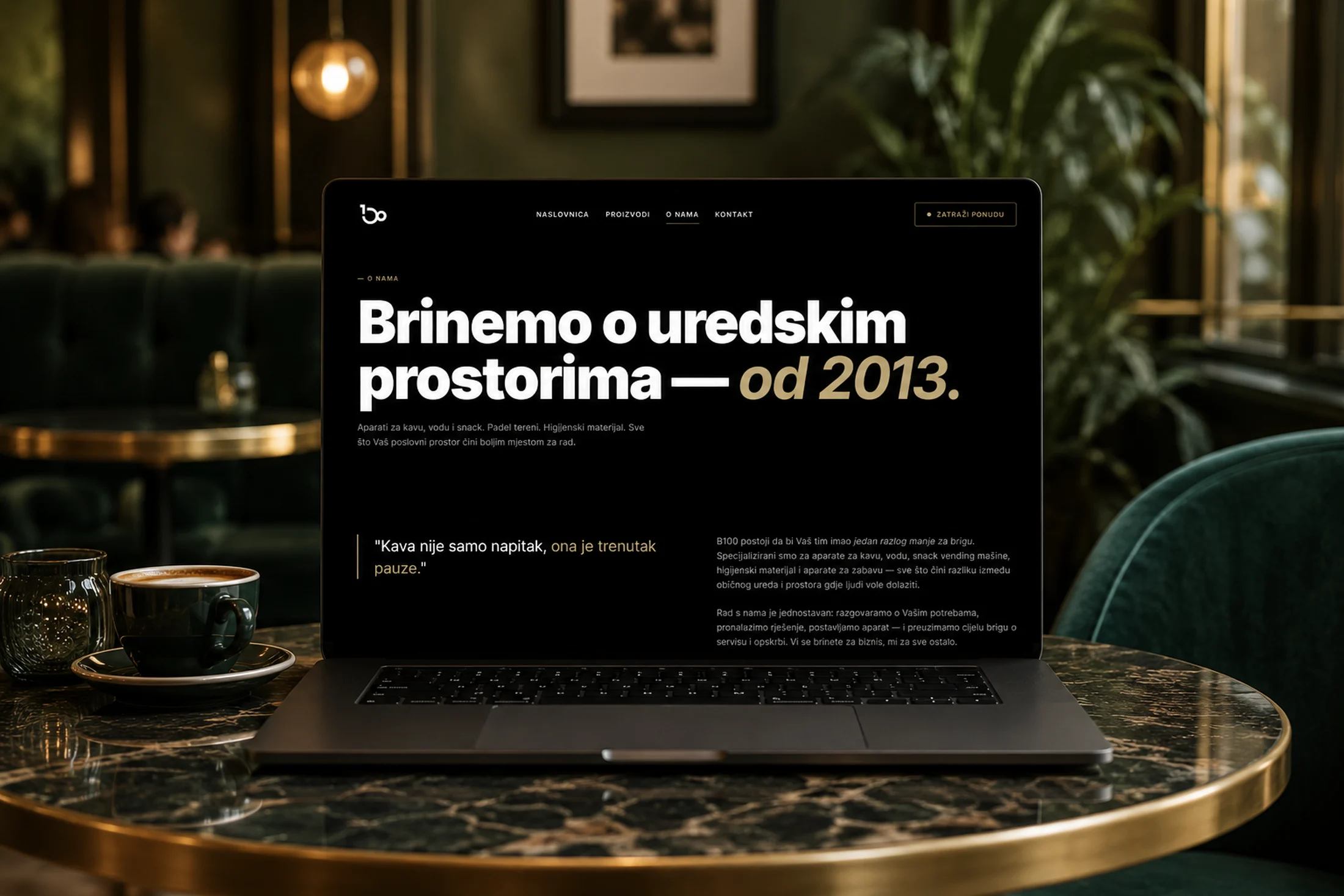
B100 d.o.o. is a Croatian company that, since 2013, has been supplying offices, clinics, business buildings and public spaces with coffee, water and snack machines, hygiene products, entertainment machines and premium padel courts. The goal was to build an entirely new website that presents this full range of services in one place, feels serious and premium, and guides the visitor toward a single action — sending an inquiry for a free quote. I designed and developed the whole site from scratch, from concept and visual identity to the code, the content and the server setup.
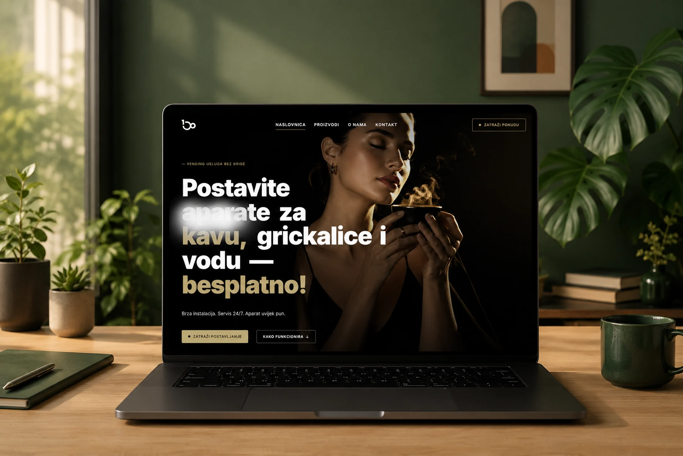
I built the visual concept around a premium, editorial mood in three colours — black, white and a warm gold (#c2aa74). The typography is carried by the Inter typeface in several weights, from regular up to the heaviest 900 black weight that gives the large headlines real presence. The entire homepage runs on a black background so the gold accents and the product photography stand out. To keep type and spacing consistent across every device, I set up my own design-token system in CSS: all colours, font sizes, spacing, transitions and layers are defined as variables, and the headlines scale fluidly with the screen width so they look right on a phone and on a large monitor alike.
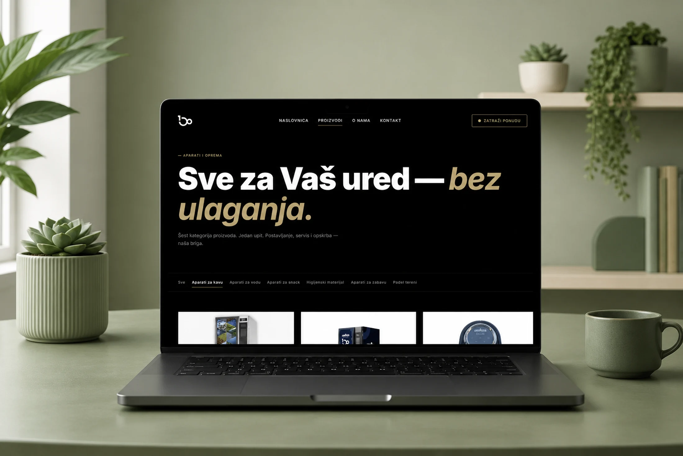
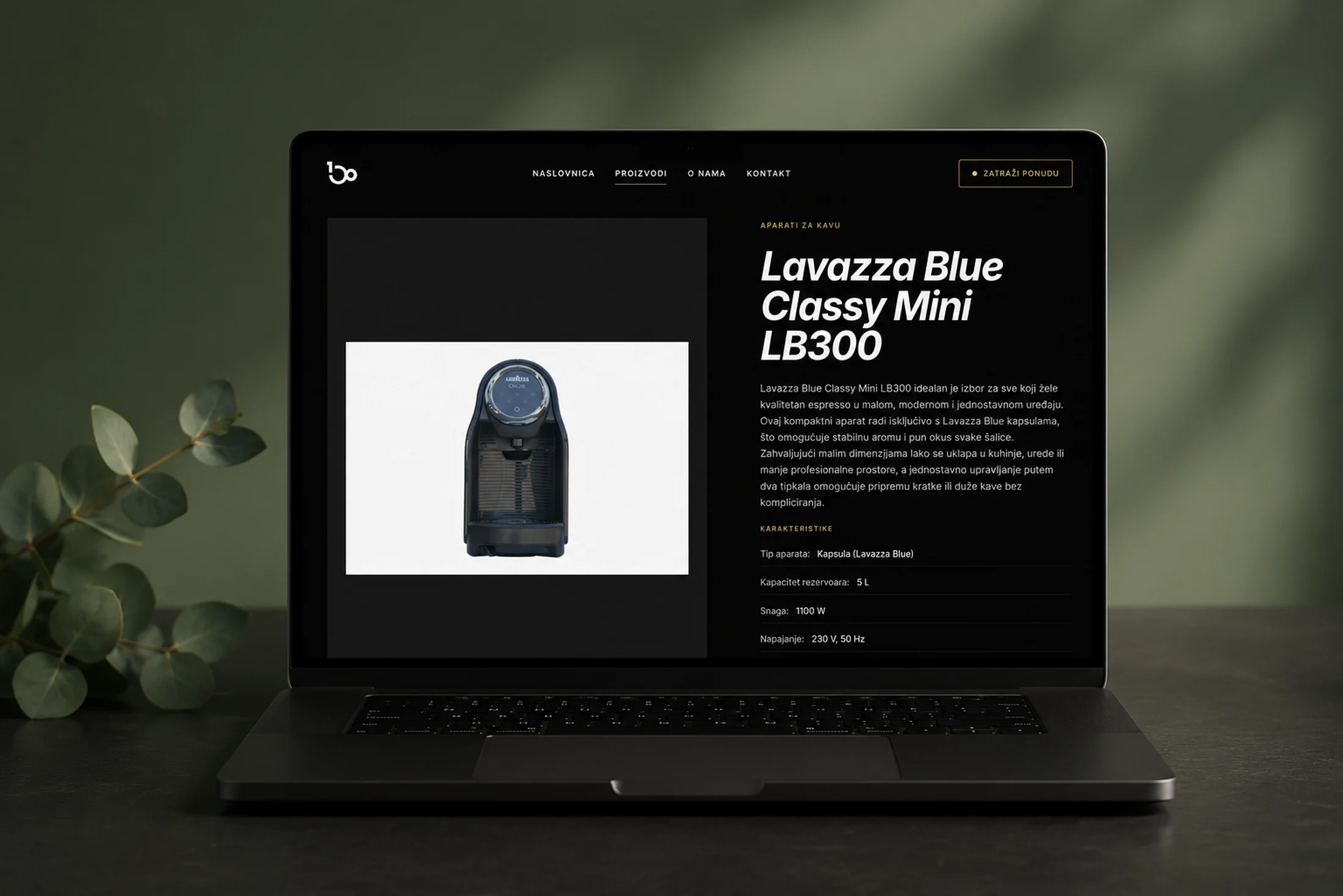
Technically, I deliberately built the site with no framework and no build tools — plain HTML5, modern CSS and JavaScript as ES modules, plus PHP 8 for the contact form and the server-side rendering of the product pages. This approach makes the site extremely fast, easy to maintain and editable directly, without a complex development environment. The whole product catalogue is driven from a single JSON file that behaves like a small CMS: it holds 61 products organised into six categories, and each product carries a name, a category, a main image and a gallery, a short and a long description, technical specifications and a “featured” flag. Adding a new product is just one new entry in that file — everything else (the cards, the filters, the detail page, the featured items on the homepage) is generated automatically.
The homepage is designed as a journey through a story. It opens with a hero whose headline words enter one after another, and above the word “coffee” I created a custom smoke-and-steam effect rendered live on a canvas — a system of nearly a hundred particles that rise, expand and fade, with a subtle SVG distortion like heat shimmering above a cup. The effect intelligently runs only while the hero is in view and shuts off completely once you scroll past it, so it never wastes resources. Below the hero comes a trust band with figures that animate by counting up to their value (over 300 active locations, a 4-hour service response, 13 years of experience), then a call to action, a three-step “How it works” section with a photo of a technician in the background under a dark overlay, an overview of the kinds of spaces they serve (offices, clinics, business buildings, public spaces), a grid of six product categories with machine photos whose backgrounds I removed so they float cleanly on the surface, a dynamic carousel of featured products and, finally, a quote from a satisfied client.
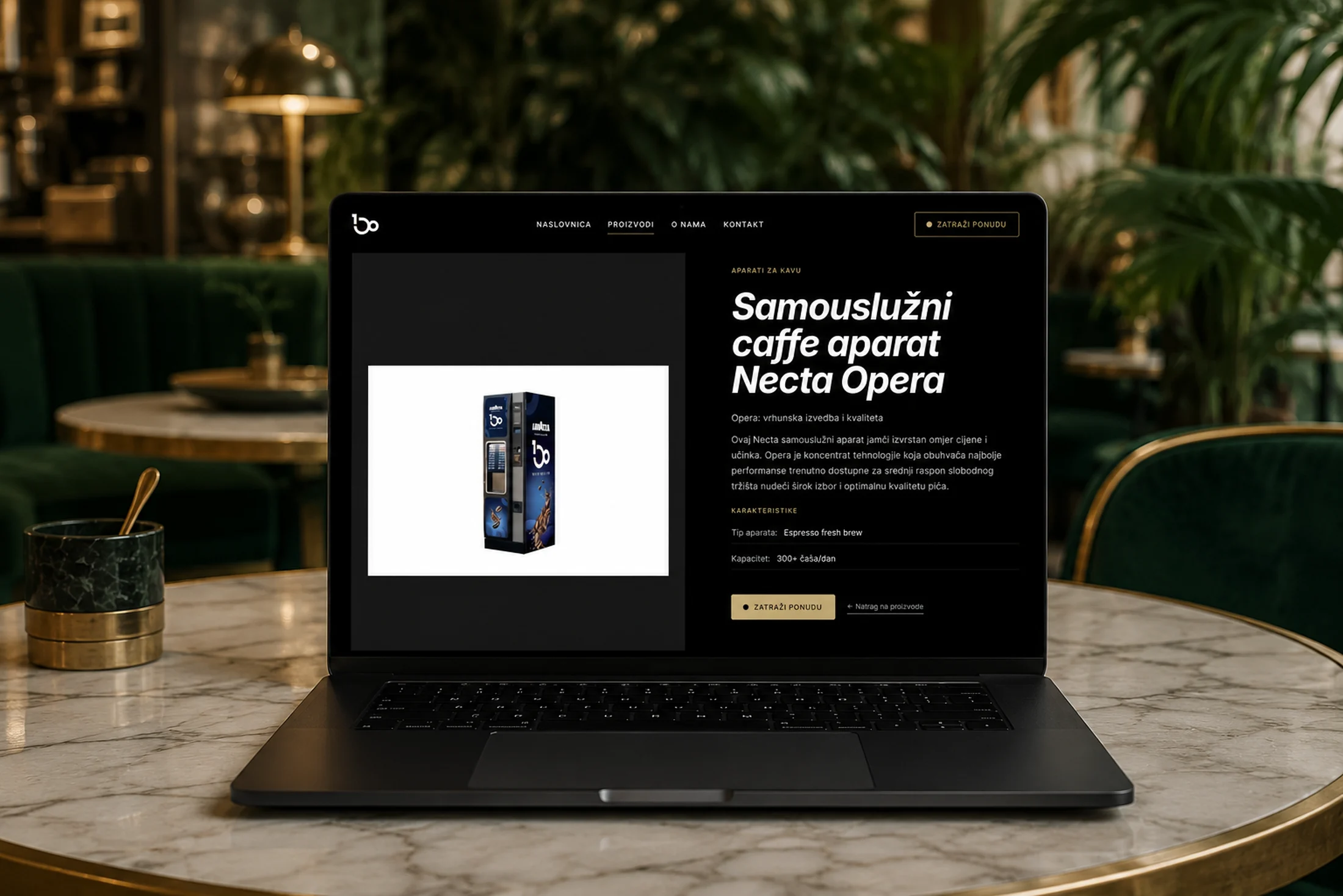
The products page offers an overview of the entire range with filtering by category, where the selected category is remembered in the page address so a specific group can be shared directly by link. Every individual product has its own page, rendered on the server from the JSON data and available at a clean, tidy URL in the form /proizvod/product-name. These pages have an image gallery with switchable thumbnails, a specification list, a description broken into neat paragraphs, and an inquiry form already tied to that specific product, so the company immediately knows what the inquiry is about. I also handled the case where a product does not exist — it then shows a tidy message and returns a proper 404 status.
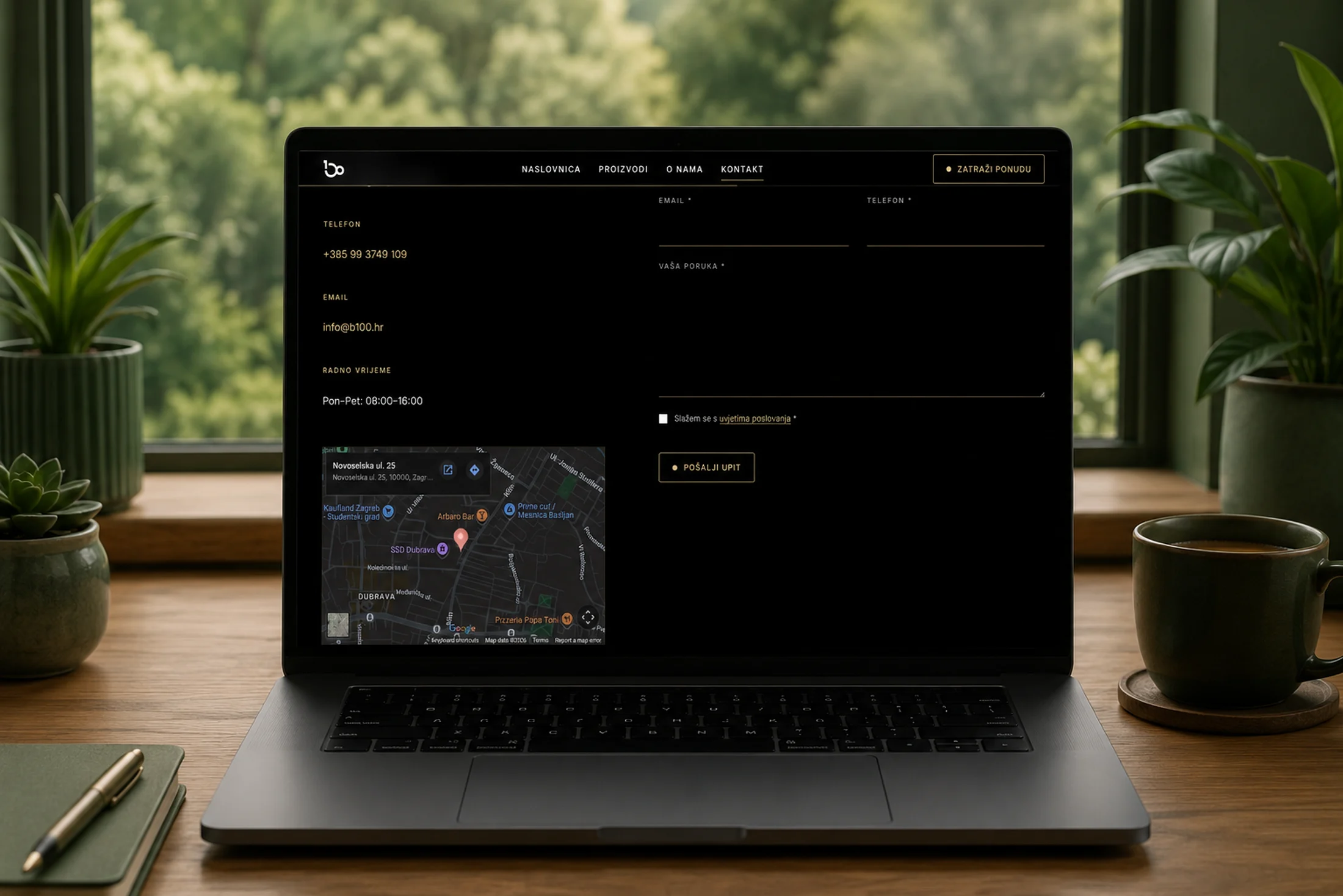
The contact system works through a form connected to a PHP backend that sends the inquiry to the company’s official email. The form has browser-side checking with clear error messages, and on the server an additional validation of the data, input cleaning, a referrer check and a hidden “honeypot” field that silently rejects spam bots. After a successful send, the user is taken to a dedicated thank-you page. Alongside the form, the contact page has an embedded Google map of the location in Zagreb that I styled to fit the dark design, plus all the contact details and opening hours.
The whole experience is refined with a series of subtle animations and details. The site opens with a short loading screen featuring the logo and animated steam; the header is sticky, has a thin reading-progress bar and changes appearance on scroll; sections and cards gently appear as they enter the viewport; buttons magnetically follow the mouse cursor, and a custom gold cursor appears over links and buttons. On mobile there is a full-screen menu. All of these animations switch off automatically for users who have enabled reduced motion in their system, as well as on touch devices where they make no sense, so the site stays pleasant and accessible for everyone.
A large part of the work was in what is not immediately visible. The site is fully optimised for search engines: every page has its own titles and descriptions, Open Graph and Twitter tags for a clean preview when shared on social media, canonical links, a sitemap and a robots file. I converted all the photography to the modern WebP format for smaller sizes and faster loading, with lazy loading for images that are not visible right away. There is also a GDPR cookie bar with separate consent for necessary and analytics cookies, and the content is accessible thanks to semantic HTML and ARIA labels. The site is connected to the legal pages for terms of business and privacy policy, and has its own 404 page.
On the serving side, everything is arranged for production: through the Apache configuration I handled clean URLs, forced redirection to HTTPS, domain normalisation, redirects from the old addresses of the previous WordPress site to the new ones, and a proper caching policy in front of Cloudflare. The end result is a fast, elegant and fully self-contained website that faithfully presents B100 as a serious partner and quietly leads the visitor to an inquiry.